Showing posts with label Dealer brochures. Show all posts

Tuesday, January 25, 2011

1965 Dodge Dart: Perfect Size for 2011?

I'm especially taken with this bright red GT hardtop coupe, with the black half vinyl roof, bottom. There is just enough chrome trim and detailing on it to make it stand out for all the right reasons. The black vinyl bucket seat interior is really fetching as well! The well-drawn proportions of the base models at the top illustrate how important it is to get the car "right" before you add any extra trim to it. Chrome accents and two- or three-tone paint can set a car off, but they can't be used to make a poorly proportioned vehicle "right."  The same holds true with so many disciplines in the creative world. When I was designing publications full time and leading an art department, I could never stress enough to my artists that they get the basic design of the page, or cover, correct, before they started adding details like shadows or colors. Many of them would try to "wow" me with typographic "tricks" right away before they got the layout right, and believe me, you really can't "save" a bad design with filigree or "pretty clutter!" Click to enlarge to full-screen.

M Y   C O L L E C T I O N — In 1965, Dodge's smallest car was the Dart, available in three series: Base, mid-level 270 and "luxury" GT. Body styles ran the full sixties gamut, from 2- and 4-door sedans, to 2 door pillarless coupes, convertibles and 4-door wagons. They were available with six- and eight-cylinder engines with ratings from 101 hp to 235 hp, 3- and 4-speed manuals or an automatic transmission. 

Though they seemed small back then, seen in today's light, their 111" wheelbase (106" on wagons, shared with the Plymouth Valiant) place them squarely in the mainstream of 21st century sedans. Their curb weights of approximately 2,800-3,000 lbs are much lighter than similar-sized cars of today, but that's largely the result of all of the added safety equipment and crash structures our cars must now possess. Though the '65 model's styling shown is credited to Elwood Engel, the basic chassis and proportions date back to Virgil Exner's sensational 1960 Valiant. 

Engel's philosophy was to "fill out the square" in both silhouette and plane views, but there is a humble honesty to these cars that's very appealing. The hood and trunk lengths are just about perfect, the greenhouse and roof shapes are attractive, and the chrome strip that wraps from the taillights up and over the rear window on the pillarless coupes is really well done. The half vinyl roof seems a bit flamboyant, almost Exner like, and wouldn't really catch on with the rest of the industry for several more years, becoming more of a seventies cliché. It's just about perfectly executed on this Dart GT.

One is lucky today if a car is available in anything but a 4-door sedan, and if it is, the additional body style is usually a tall wagon. With all the advancements in computer-aided design and electronic "robotic" construction, I just find it odd all we can seemingly come up with are sedans. To top it off they're usually painted gray with a gray interior. Even though this was Dodge's least expensive, and smallest car, it came in a full panoply of body styles and trim levels. Interiors came in several color choices, usually red, green, blue, beige, white and black, and in a choice of cloth or vinyl—we hadn't yet felt it necessary to skin a cow for every single car in the 1960s. 


B T W :
I just remembered I've photoshopped one of these 1963-'66 Darts before. This is a 1963 Dart convertible in which I smoothed out the sides a bit, and added fender skirts for that proper "Cruiser" look. I chopped down the windshield a little to give the car a longer, lower appearance. I also dropped it closer to the ground a few inches and upped the wheel size, though I kept the sixties wheelcovers and white walls.

Thursday, January 20, 2011

1965 Dodge: First Monaco, Last Custom 880

A couple of spreads from one of my 1965 Dodge brochures, featuring the Custom 880 6-window sedan at the top, and the brand-new "personal luxury" coupe, the Monaco: "For the man with unlimited taste" on the bottom. Umm, something tells me no Dodge dealer turned away women that were willing to sign on the dotted line! Click image to enlarge to a full 1500 pixels in width.

M Y   C O L L E C T I O N — 1965 was a major transitional year for Chrysler and its Plymouth and Dodge divisions. This was the first year that Elwood Engel's "clean sheet" designs would be seen, the C-body full-sized cars. Engel's full-square, body pushed all-the-way-to-the-corners design ethic is clearly in evidence, in stark contrast with the former VP of design Virgil Exner's more flamboyant and exhuberant style.

Featured above is a sedan in what would be the Custom 880's last year. The Custom 880 shown in the catalog was the beautiful six-window sedan, a body style shared only with Chrysler for 1965, and the only year Dodge would utilize it. For '66 only the four-window sedan would be marketed by Dodge. Also pictured is the Monaco coupe in its first year on the market. Dodge was ever jealous of Pontiac's perennial sales lead over Dodge, and tended to come up with competitors for Pontiac on a model-for-model basis. The Grand Prix's rising star, and sales, didn't go unnoticed at Dodge, and for 1965 they came up with the specialty Monaco. It was only available in this svelte coupe, with a special 4-place interior, complete with Rattan trim on the dashboard, door panels and the backs of the front bucket seats.

For '66, Dodge would "water down" the Monaco nameplate, replacing the four-year old Custom 880 with sedans, coupes, and wagons, and the specialty Monaco coupe would become the Monaco 500.

Monday, December 27, 2010

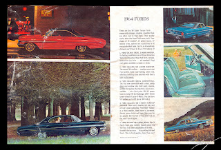
Ford's "Total Performance" for 1964

As perfect as my 1962 Ford brochure is, my '64 version is decidedly less so! Unfortunately this brochure was stored in my Mom's basement for years and years, and went through a couple of episodes with broken sump pumps and flooded basements. The cover and back cover suffered the most, sticking to whatever was on the top and bottom of them, but the interior has water damage too. This was a great year for Fords so I kept it, and hopefully it won't deteriorate any further. This piece has a litho date of 1963, and is missing Ford's brightest star for '64, the Mustang which wouldn't be introduced until April 17th of 1964. 

Featured in it though are Ford's almost completely restyled lineup, from the new sheetmetal and rooflines of the full-sized Fords, to the heavily facelifted Fairlane, and the completely restyled Falcon and Thunderbird. Illustrated above, in the opening spread featuring all of the new Fords, is a photo of the Swing-Away steering wheel in a Galaxie. My '64 Tbird came with that unique feature standard, but I never realized that it was optional on the full-sizers as well.

The Galaxies and Customs featured brand new rooflines. The four door pillarless hardtop is one of my all-time favorite large Fords, although it took me many years to come to that appreciation. This four door was available as a 500/XL complete with bucket seats and console! Note the blue 2 door in the upper right-hand corner. It's ID'd as the 500/XL convertible, and on close inspection it is, but the airbrushing artist got the roofline totally wrong. It has the "slantback" roofline of the hardtop. I thought they had just inserted the wrong photo, but on close inspection, the stainless trim at the base of the roof includes the snaps for the convertible's roof cover and the roof's details are different from the hardtops. Oops! 

Interestingly, the Galaxie/Custom line is given a third page in this 12-page brochure, and the Fairlane is only given one page. The Fairlane was heavily facelifted this year, with new roofs and new bodies, and would be again in '65. In '66 it was completely redesigned in a larger package, and was impressive enough for my Dad to come home with a bright red 500/XL hardtop coupe.

The completely redesigned Falcon is featured on these two pages. It was much more sculpted and angular. Bodystyles included sedans and hardtops, as well as the sporty convertible. The Econoline van was included in the Falcon lineup, called the Deluxe Club Wagon in passenger trim.

My beloved '64 Thunderbird! Photos highlight the cozy "Twin Cove" rear seating in this series of Tbirds, as well as the absolutely perfect profile proportions seen here on the Landau. The convertible's clean lines is obvious on the red 'Bird, the result of the modified retractible roof mechanism of the '57-'59 Fords and first 4-seater Tbirds of '58. The soft top retracted completely into the rear trunk, which opened up electrically "backwards" to accept it. It then closed with a smooth metal cover replacing the usual bulky boot-covered rear stack for an oh-so elegant appearance.

• This '64 Galaxie 500/XL 4 door hardtop was sold a long time ago, but the link still works. It shows the 4 door with bucket seats, and just how well-trimmed and special Ford's Galaxie interiors really were.
• That same purveyor of vintage cars, Memory Lane, also has this great '64 Falcon Sprint convertible for sale. Thanks to loyal reader, Woody, for posting the link in the comments. I'm adding it to the "front" post so everyone sees it, What a great looking little convertible, and it's a great suggestion of Woody's that Ford sell a new convertible for less than its current Mustang.

Sunday, December 26, 2010

Classic Domestic Car Lineup—Ford for '62

When I think of a "classic" American carmaker's full lineup of product offerings, the 1962 Ford perfectly fits the bill. They had a compact, an intermediate, a full sizer, a luxury offering, and even a "people mover" or van as they were called back then. The Falcon, Fairlane, Galaxie, Thunderbird and Econoline are really all anyone needed, or needs today!

My father came home with a black Galaxie 2 door post sedan in 1962, with a 390 V8 engine, the lightest-weight bodystyle with the FE series V8. There were also a couple of 406 engines available but apparently were special-order only, and my father was an impulse "buy from the lot" type of guy. For a young car lover, he certainly gave me some great surprises growing up because of that!

To make "room" for their upcoming intermediate, Ford renamed all of its full size cars "Galaxie" for 1962. Higher trim levels were thus the Galaxie 500 and 500/XL, adding trim and features and equipped to near luxury levels. Elegance was stressed, as can be seen in the way the Galaxie was photographed. The Falcon also added a new model this year, the Squire wagon, available with bucket seats if so desired! The new Falcon Futura featured Thunderbird-inspired bucket seats, console and thickly padded vinyl interiors.

Though there were "senior compacts" from GM in 1961, Ford really can be credited with creating the new "intermediate" class in 1962 with its Fairlane. Interestingly, this new class of cars, fitting perfectly between the compacts and full sizers, this '62 Fairlane used the 115 inch wheelbase of the very popular full size Fords of the mid Fifties. Ford even plucked the Fairlane moniker from that popular series of Fords. For this new car however, Ford used unibody construction, similar to the Falcon's, for lower weight. Ford kept this construction for its intermediates until the 1972 model year.

At the top end of Ford's lineup, the luxurious and sporty Thunderbird added two new models for '62. The now-classic Landau luxury coupe and Sports Roadster convertible both made their first appearances. The Landau upped the luxury ante inside with lots of woodgrain trim and added a vinyl roof complete with "S" bars on the C pillar. The Sports Roadster used a fiberglass toneau with built in headrests covering the rear seats. This was meant to evoke the original 2-seater Tbird, and has become a highly-coveted collectible in its own right. The bottom spread illustrates all of Ford's passenger cars for '62, really a lineup for the ages, in my opinion!

B T W : 
This piece is entitled, "Ford Owner Newsletter Supplement, The Long Ford Line for 1962," measures 11 x 8 3/8 inches and is 16-pages including front and rear covers. The layout is almost haphazard when you look at all of the spreads as I've scanned and grouped them here. The fonts are consistent throughout, but the sizes aren't for the titles. There is not much of a discernible template, as text column widths and photo widths vary. This piece is in exceptional condition, a bit odd since it wasn't an expensive piece to produce—no glossy varnished pages, no heavier-than-usual paper stock. I think it's all the more desirable to me because of it!

Wednesday, December 22, 2010

The First Small W-I-D-E Car: Bubble-icious!

The cover of AMC's 1975 catalog, featuring the first Pacer.

In 1975, AMC wowed the automotive world with its earth shattering, groundbreaking, Pacer. Billed as the first small, wide car, the Pacer measured a full 77 inches wide, 6 inches wider than the company's Hornet and Gremlin, and the equal of their full-sized Ambassador sedan. Another unique feature of the Pacer was the use of asymmetrical doors; the passenger's door was 4 inches wider than the driver's door for easier access to the back seat. Its wheelbase was 100 inches, the equal of its spiritual predecessor of sorts, the spunky 1950 Nash Rambler convertible, the car Lois Lane drove in the original Superman TV show (and who didn't love the young Jimmy Olsen in that series, played by Jack Larson, lol!). 

Pacer's relatively short hood was a result of the planned use of GM's brand new rotary Wankel engine, a compact powerplant that was cancelled at the last minute by GM after the first gas "crisis" of 1973. Wankel rotary engines are powerful for their size, but thirsty, and after several years of development under license from Germany's NSU, their lack of economical gas usage and a failure to properly seal the rotors, GM called it quits. Mazda is the only manufacturer of Wankel rotary engines today, in their RX-8 sports coupe, and they're still considered thirsty for their size although the sealing problem has been overcome. AMC was stuck without a powerplant that fit under the short hood, and their inline-6 engines ended up with their last 2 cylinders practically sitting in the passenger compartment. For a longer write-up of the Pacer's development, I found this cool website.

Pages 3 and 4 of the brochure show the front and back of the wild new car, with interior shots as well. Both pages open up to a full four-page spread, below. On the left, in H8 Autumn Red, is the D/L model, and its optional "Basketry Print" fabric individually reclining bucket sets. Talk about distinctive! AMC really showcased unique interiors in their products, a tradition that went all the way back to the 1930s when Nash introduced their infamous "seats that fold into a bed." The H9 Silver Dawn base model Pacer on the right, shows the optional vinyl roof, separated by a body color "hoop" which was reminiscent of Nash's 1956 "Fashion Arch" styling, which allowed for a C pillar two-tone paint treatment also known as a "basket handle" to some. The Pacer's original bodystyle was eventually joined by a wagon version, which was just as wide and fishbowl-like as the hatchback, but which could be optioned with woodgrain sides—a plus in my book!

The four-page fold out showing the Pacer X model, and giving specifications and options. One quaint touch on such a futuristic new car was the option of good old-fashioned vent windows in the front doors. Oddly, under "power options" only power steering and power front disc brakes are listed. I would have thought power windows, door locks, and seat would have been available, and I think they were in later years.

BTW:
Motor Max's 1978 Pacer from their "Fresh Cherries" series. This scale model features the facelifted model with its rather ugly raised front hood and grille, necessary for the 304 V8 that was made optional later in the production run, but it's nearly invisible under the plastic case, lol. The rest of the scale model is pure, bubblacious and curvaceous, Pacer. The notes on the back of the package states that slightly over 280,000 Pacers were sold in the six years of production, a large volume for AMC. 

Tuesday, December 21, 2010

The Sensible Spectaculars: '65 Rambler Lineup

This is a small AMC brochure featuring its full lineup for 1965, eight-pages, 10 1/2 x 6 1/2 inches. It was probably a car show piece, which frequently were smaller, cheaper and featured all of a makers car in one brochure. I've always liked the typography used in this piece, with the word "spectacular" printed in a full rainbow of colors—truly spectacular! The cover image shows the familial resemblance that Edmund Anderson brought to AMC that year, with all three lines featuring segmented horizontally-ribbed grilles and simple bumpers with amber turn signals located at the other edges.

The Ambassador for 1965 was redesigned and once again gained length and prestige with a 4-inch stretch in wheelbase to 116". This compared with the 108" of 1962 and 112" of the 1963-'64 models, but still an inch short of the 117" span of the '58-'61 models. Vertical headlamps, first seen on the '57 Nash, and later on the '63 Pontiacs, gave the Ambassador an upscale appearance. It's too bad that bodystyles didn't include a 4 door pillarless hardtop, as Nash offered them as far back as '56 for sedans and even wagons. Technical features included "Double-Safety" brakes with optional front Disc Brakes, V8s and a new inline 6, adjustable steering wheels, reclining bucket seats and new "miracle" fabrics. I love that sliver of woodgrain on the wagon, and that dark blue sedan is elegant!

The '65 Classics featured a 112" wheelbase, and sported new and larger-looking facelifted bodies. Bodystyles included a 4 door sedan, 2 door pillarless hardtop, convertible and wagons. Engine choices included a Six and several V8s, and the wagon could be had with 2 different tailgates, one that folded down and one that swung out. For '66 Ford offered its first "Magic Tailgate" that could do both, but AMC gave you one or the other.

Ah, the Rambler American, the direct descendant of the first 1950 Rambler. Offered only with sixes this year, the American had features such as curved side glass, a standout feature in the low-price class. Available in a full spectrum of bodystyles and trim levels from basic sedans to sporty and luxurious hardtops and convertibles, a Twin-Stick transmission was also available, which included a separate overdrive lever. Those red vinyl reclining bucket seats are glorious, aren't they?

Update:
Both the Classic and Ambassador were available as 2-door sedans as well, for both '65 and '66, in various trim levels. They weren't included in this brochure, but as they weren't considered "sexy" I can see why they left them out of this very small car show edition. Thanks to loyal, and erudite, reader, Paul for this clarification! See the comments section for the details. I think this is the best part of my blog—the dissemination of information from "both sides" of the keyboard! Thank you.

Coming Up Very Soon by Popular Demand:
I've just found my 1975 AMC brochure featuring the first wide small car, the fishbowl on wheels, the Pacer. Scanning as I type this!

Monday, December 20, 2010

Does Anyone Remember the 1981-82 Granada?

Because I Certainly Don't Remember This Second Generation!


If you had asked me yesterday whether Ford made a second generation North American Granada, based on a slightly facelifted Fairmont, the Fox platform, I would have said no. I don't remember it at all! I don't think I've ever seen one in person, certainly not the coupe with its attractively widened C pillar (compared with the Fairmont). Apparently I picked up this brochure at the dealership 29 years ago and never looked at it again until this morning! Talk about "like new" condition...

Looking at this car with my 2010 eyes, I can honestly say it's pretty decent looking. It's a bit more formal than the Fairmont, a bit fussier in detail, but the changes aren't heavy-handed at all, and add a bit of class to the car if you ask me. The black coupe, below, is downright elegant looking in that honest way that Fords of a certain vintage always possessed. They were available with four-, six- and eight-cylinder engines, and were all rear-wheel drive. They came in L, GL, and GLX trim levels for '81, in coupes and sedans, and added a wagon for '82. 

The Mercury version for this 1981-82 second generation was no longer called Monarch, it became the Cougar. For '83 the Granada name was retired for good, replaced with yet another facelifted Fox body, and renamed the LTD. At that point, the "Fox" Cougar became the Marquis. The early '80s was certainly a fluid time in terms of Ford's naming practices, as they tried to downsize their models and keep up with the times. Jack Telnack's "aero" age was just around the corner . . .

I swear I've never seen one of these coupes in either Granada or Cougar guise. Compared with the original Fairmont, the wider C pillar is good looking! I really like it in this all black version. It's tasteful and appears light; it's elegant without being ornate. The proportions are great for a mid-size Eighties automobile.

The GLX trim level was the top of the line, but oddly came with blackout trim on the rocker panel moldings, B pillar and window frames and headlight recesses. The interior came in vinyl buckets or optional split bench seats with dual armrests. It's "sort" of sporty with the black trim, but the interior was "luxury" oriented with lots of woodgrain.

For the rest of the trim levels, and the options page, click the jump link.

Sunday, December 19, 2010

AMC's Designer Hornet Sportabout

The back of this one-page folder shows, at age 15, I was quite intent on pricing out this little gem. I'm sure I was using the Consumer Guides' pricing book, which was available at any magazine stand.

M Y   C O L L E C T I O N — The 1970s fascination with designer labels had a very unlikely participant in the 1972 AMC Hornet Sportabout wagon. Gucci, one of the premier Italian design houses, designed a "special" all-vinyl interior  in his then-trademark colors of green, red and cream. The headliner featured his interlocking GGs logo, and there appears to be some sort of ceiling tray illustrated as well. The 1970s were not the best for Gucci, almost going into bankruptcy by decade's end, and I can't help but think that creating a multicolored interior for an American economy car, wasn't one of their savviest decisions. According to Wikipedia, slightly more than 2500 Gucci-equipped Sportabouts were sold in 1972, with an additional 2200 in '73, so it wasn't a sales flop by any means. Italian luxury could have been yours for just a few dollars shy of $150 in 1972 currency.

For a well-written blogpost about the 1970s designer edition cars, including the Gucci Sportabout, click over to Palm Springs Automobilist from July 26, a fellow blogger that has commented here before. In fact, I just added his site to my Blog Roll on the right side of this blog.

Halston, Gucci, Fiorucci!—The music industry wasn't immune to the charms of the designer label either. Here is a link to Sister Sledge's He's the Greatest Dancer, which drops designer names like loose sequins on a dance floor, lol. Of course, the Sisters best known hit disco song was We Are Family...

Mid-Sixties Sunbeam Minx 1600

I'm guessing this 2 page sheet for the 1965 Sunbeam Minx 1600 De Luxe Sedan is one of my more obscure pieces of dealer literature. It's just the front and back of a single 8 1/2 x 11 1/2 inch sheet, with a color photo on the front and the specs listed on the back. I scanned the back in a higher resolution, so hopefully the type can be easily read when it's enlarged. Check out the color options: There were eleven single tone- and nine two-tone exterior finishes available, matched with eight different interior color options! For a brief history of what was known as the Hillman Minx in its UK home market, click over to Wiki.

Thursday, December 16, 2010

"Unique in all the World," 1971 Final Edition

The 1971 two door Landau coupe, with its revived blind rear quarter roof panel, a look that was used in 1966, and 1969 as well.

M Y   C O L L E C T I O N — There is a case to be made that the 1971 Thunderbird was the final edition of the original "4-seater" Tbird's life, first produced for the 1958 model year. Prior to that was the now-classic 2-seat convertible built from 1955-57. Other Tbirds were built on several different platforms until the late 1990s culminating with the revived roadster of the 21st century, but the '58-'71 versions, to this writer, represent the "real" Thunderbird. 

Many people consider that "real" line ended in 1966, as the '67s abandoned unit-body construction in favor of a separate frame and body, but the '67s-'71s carried on so many unique Thunderbird traits and features, including the close-coupled interior and styling proportions, they are completely 100% classic Tbirds to me. Beginning in 1972, in my opinion, Thunderbird began the long slide to oblivion, although this was not the opinion of the general buying public. The "mid-size" 1977 edition, which was really a deluxe Gran Torino along with a greatly-reduced list price from the luxury-class Tbirds of the past, sold in the many hundreds of thousands per year, but was about as "unique" as shag carpeting in a 1970s family room. 

Bucket seats and a console had been an option since the late sixties, but represent the quintessential Tbird  experience to me. This emerald green cloth interior is gorgeous, isn't it?

The 4 door Landau was entering its last year in 1971, its suicide doors consigned to the halls of history until Casey/artandcolour began their revival in the mid 2000s, lol.

The 4 door's optional Brougham interior was as luxurious as the early 1970s got, as luxurious as any car ever needed to be in my opinion! This is still a pinnacle of design and execution.

While the Landau coupe reverted to the blind rear roof of earlier models, the base Thunderbird coupe kept the wonderful fastback roof from 1970. Though only a very clever facelift of the 1967-69 models, the windshield and roof was cut down about an inch and a half, making for this very stylish silhouette, another high-point of Tbird design.

The cover of the '71 Tbird brochure featured this three dimensional Thunderbird, raised and embossed, creating a sculptural appearance. It seems to be modeled in clay or wax, and the paper used was a heavy stock with an almost burlap texture. 

Friday, December 10, 2010

"The New American Car," 1970

Cover and back cover of the introductory brochure for AMC's new-for-1970 subcompact offering, the Gremlin. The booklet is 7 3/4 x 11 inches with a total of 8 pages (I didn't scan the last spread). The entire brochure is cleverly art directed in red, white and blue, emphasizing the American-ness of this newest, and most radical-looking domestic subcompact, basically a cut-down Hornet, also new for 1970.

Spunky and fresh, with a profile unlike any domestic car produced at the time. Gremlin's ads often compared the car with VW's Beetle. The Gremlin eventually morphed into the AMC Spirit and lasted in facelifted form right through 1983. With a second bodystyle added, a really good looking fastback, the Spirit was even marketed as an AMX. As an Eagle Kammback and SX/4, it was available with All-Wheel Drive.

Available in both 4-seat and 2-seat versions, the 4-seater came with a lift-up rear glass hatch, while the basic 2-seater came with a fixed rear glass, meaning luggage had to be loaded through the side doors. Originally available only with 6-cylinder engines, 199 cubic inch standard with a 232 optional, the little car eventually offered a V8 in subsequent years, as well as sportier looking "X" packages. 

Wednesday, December 8, 2010

Racing Through the Universe

Mercury's Comet Shone Bright in '65


Cover, back cover and introductory spread, pages 2-3, of the full color 1965 Mercury Comet brochure. This piece measures 9 1/4 x 11 inches and is 20 pages including covers. 1965 was the final year for the Comet to use this extended Falcon platform, as it would become a "real" intermediate sized for 1966, sharing a chassis with the Ford Fairlane. For 1965 however, the Comet and the Falcon were still twins under the skin, and even shared front doors and cowl assemblies, albeit with the Comet having a slightly longer wheelbase on its sedans and coupes. 


This catalog was very nicely art-directed. The main spreads have a specific color theme, and it's really nice leafing through it; it keeps you wondering what color the next spread will feature. I remember Ford using a similar technique with its '64 Thunderbird catalog, of which I have a gorgeous deluxe version I once paid a fortune for. Click these images to enlarge them and see the cool artwork. 


Muy Caliente! The top Comet trim level was called the Caliente, while the mid-level was the 404. If you look at the white 4-door in profile above, you'll notice the rear doors don't really jive with the rear wheelwells very well. This is because its wheelbase was lengthened a couple of inches just in front of the rear wheels and the Falcon's doors, made for the shorter wheelbase car, didn't quite line up. Again, the Comet didn't sell as well as the Falcon, so the bean counters didn't allow Mercury to restyle the doors. It's a testament to Mercury's designers that the two cars look so different from each other. The Falcon's strong bodyside sculpting was softened in front of, and behind the doors, thoroughly changing the look of the cars. 


The base Comet was the 202, pretty much a bare-bones model, while the "hot" Comet was the Cyclone—a great name! The slantback pillarless bodystyle of the Cyclone really worked to my eyes. The Cyclone came with a chrome engine dress-up kit, its own grille treatment, bucket seats, console and a walnut-grained steering wheel. The black vinyl roof was a new option.

Comet and Falcon wagons shared bodies, with the Mercury merely changing the front clip and some reat trim. As a child I always wondered why the Comet's wagon had a shorter wheelbase than the two- and four-doors. It seemed to me that a wagon should be longer in the back for cargo space. I just didn't understand the fact that the Falcon and Comet shared the entire wagon body. For the number of wagons sold, there wasn't money to change the rear side windows etc for the Comet's longer wheelbase. Looking at them today, I can see the Falcon so clearly in the body, but I really couldn't as a child.

The last four pages were devoted to accessorites and technical information. In the word "specifications" note the use of the ligature "fi" which typesets the letters "f" and "i" as one character. Bravo!

B T W #1: 
A word about the typography on the series pages in this catalog
Notice the "1965" at the top of each section. The numerals include descenders and ascenders, they don't lie on the baseline like most font numbers do. They're called "old style" and I find them extremely elegant. They're not included in every font, in fact, they're relatively rare. I've used old style numerals in many of my book designs, and I've even been known to use a separate font for them if the main body type font I've chosen doesn't have them as an option. 

Interestingly, in the case of the "404" the designer made the wise choice of reducing the 4 to the same height as the 0. In proper old style usage, the 4 includes a descender, which would have made the 0 appear too small. The "202" would then not have matched the "404," as the 2 and the 0 are the same size in old style.  

These are decisions great designers make every single day, sometimes on every single page they work on. Competent designers think about these details when they're pushed to, but the majority of typography I look at today is merely "typing." Today's paging programs are VERY sophisticated and can turn out decent looking type automatically. Unfortunately, very few designers go the extra mile and really customize their type correctly, so it's not just adequate, but beautiful. In my days as an art director, I trained designers to coax as much as possible out of their hard- and software. It's all in the details, and I could never stress that enough to young designers. I was VERY picky about the typography that was used in my newspapers and magazines, and I know I was called a few choice names under their breath as I walked away, lol. But I've also been thanked by some later, when they realized their work looked much better with my tweaks and direction. It's all in the details. The typography options are very rudimentary in Blogger so please don't judge me by the way this type looks! : )

B T W #2:


Comets I Have Created


Mercury has long been one of my favorite brands to create fake cars for. Sigh. With such an evocative name, and the fact that my very first car was a '69 Comet sport coupe, I've chopped a few Comets in my time.


This was just about the first car I created when I realized I could use Photoshop to render my ideas. My Comet Hybrid 4-door was basically a shortened first generation Milan, but had a cute spunky look to it, classy and elegant in an early 2000s sort of way. I think it's distinctive enough for hybrid buyers, who tend to like being seen in a "green" machine that's recognizable by everyone, but not too funky to turn off Mercury's average clientele.

This Comet Hybrid is a 5-door, not quite a crossover, but a bit taller than a regular wagon. This was meant to anchor the base of the Mercury showroom, but to have the ingress/egress points that older buyers have come to enjoy, and expect. Mercury's buyers tended to be middle-aged and older, and the space of this  may have appealed to them, while still looking clean and stylish without being vulgar. Base photo was a European Toyota Avensis.

This car was a Comet right up until the minute I started typing the name for the layout, lol. I was working on an entire series of new Mercurys for a website that contacted me about my work. I ended up never sending them to them, too bad really, but before I started this blog I often didn't follow through with plans... This Comet would have been a luxury midsizer, more like the '66-'67 Comets, which were intermediates in the medium-priced range. I included suicide doors for an uplevel touch, and it was my idea that ALL 4-door Mercurys would have them. They would have been power operated, to provide as much "street theater" as possible, to get Mercury's brand recognition to a higher level. I eventually named this car the Medalist, a cool name Mercury last used in the mid 1950s. I really don't remember the base photo. I know the grille and headlights were from a Milan; maybe the rest of the car was as well. I like it when I've changed a car to the point I can't remember, lol.


This Comet is for the 21st century. It's a "B" segment offering, the size of a Ford Fiesta, but trimmed to an even higher level. The taillights are purely LEDs, the wheels are 19" with very low-profile tires, and the interior would have had all the bells and whistles and electronic connectivity expected in a modern vehicle. The base car was a Citroën concept car, but not much was left of it, only the exhaust ports I think.